Here’s What You Can Learn From These 11 Inspirational Travel Website Designs
Remember the last time we spoke to you about 11 great resources to build a tour operator website? We are back with another team of 11. This time, we are talking about 11 inspirational travel website designs. But first here’s a question for you:
What’s inspiring about your favourite destination?
Have you ever wondered if it is the culture, people, sights and sounds or simply the vibes of a certain destination? The reasons can be aplenty for you. Here’s what we think. The hallmark of a great destination is its ability to surprise you with something new in every nook and cranny of the city. Much like a travel agency or tour operator website design, which should offer you a seamless experience on every page. We are talking about every tab, design, call-to-action, visual and word should have the wow factor!
Having worked with over 200+ tour operators and travel websites around the world, we’ve realized that a great travel website design takes time, effort, tools and resources.
Rome was not built in a day
We all know that it takes time to shape up the best travel website. There has to be the perfect blend of content and design. The question is where do you get started? We have some of the best travel business inspirational websites lined up for you and how you can leverage them for your travel agency or tour operator business website. You can also check out the fundamentals of creating a travel business website here:
Let the pictures do the talking
A good picture speaks a thousand words. A great one speaks perhaps a million. Wouldn’t it be great to have one, right on top, which will make the user go wow?
Where do you get the right pictures?
We are living in the age of the internet where there are millions of Stock images. Sites like GettyImages, iStock, Shutterstock are extremely popular. It all depends on your budget and the plans being offered.
Looking for something affordable?
Take a look at Pixabay, Pexels, Avopix, Stockvault or Public Domain Archive. These are unlicensed and free stock image websites. Extremely handy for travel website startups or new tour operators who’d like great quality images at no extra cost.
Looking for stock images from India?
Check Images Bazaar, Image Duniya, Hangon images. The pricing starts from Rs 699 per image (low resolution) to subscription plans as high as Rs 8,00,000 (100 high resolution images or videos). Take your pick.
Want something original?
Why don’t you hire a professional photographer? And guess what? You can do it at the click of a button. You have wonderful platforms such as Peopleperhour or the freelancerclub that can help you pick a photographer and get started on your travel theme or idea.
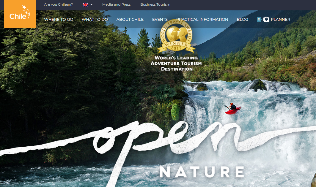
Once that’s sorted, we recommend you embellish the picture with a font or typeface that complements the flavour of your brand. You can draw some inspiration from the Chile Travel website.
➢ 3 points that you need to keep in mind
- Keep the imagery, font and design seamless, to say the least.
- Like we’d said the last time around in the first point itself, your website needs to be easy to the eye and memory.
- If you have won any awards or got recognition, showcase it just like this website on Chile. They have shown it right in the centre – Best in Travel 2018.
It’s like they say it, if you have it, flaunt it.
Surf well with the right navigation system
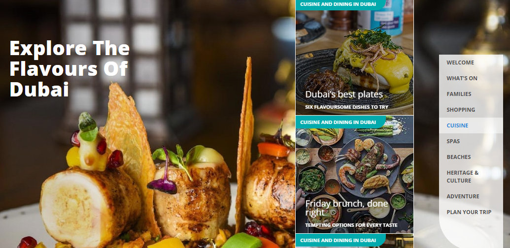
How should you be serving the content to the user? Is that always a big question for you as a tour operator? Let’s understand it with a simple analogy. Remember, when you walk into a buffet, you first go and see the various food counters and the variety on the platter. Likewise, if your tour operator website has categories, present them right at the start. Definitely Dubai does exactly that. See the way, they have laid out their categories on the right side, which keep changing as you scroll down the page. Plus, there are also links on the top to get you started.
➢ Key points to remember
- Make your layouts leaner and meaner
- Organize your itineraries or categories
- A search bar can come in very handy on your website
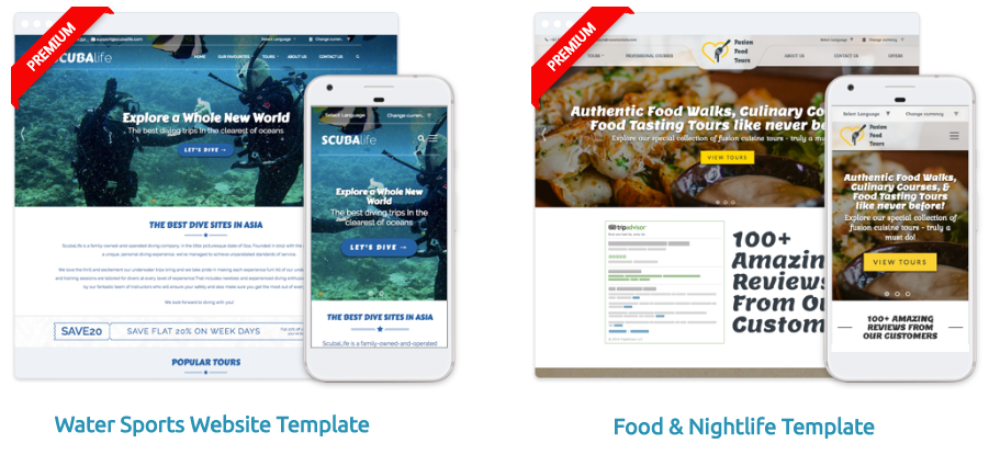
- You may want to visit our pre-designed templates and choose the one you like for your business
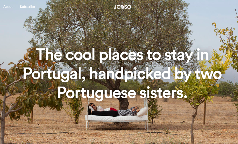
Local expertise can make your website go places
Looking for great localized content on your website? If you have discerning local experts from various destinations on your travel website, it helps you gain a global advantage. That’s because you know the do’s and don’ts for travellers and can offer them rare insights, which gives you the edge over other tour operator websites. Just like JoandSo, which offers you the coolest places to stay in Portugal, handpicked by two Portuguese sisters.
➢ Key Takeaways
- Your offering should come out loud and clear
- Set the right context, which leads to a great conversation
- Also, you should be telling the user what your brand stands for
Minimalism is the new maximum
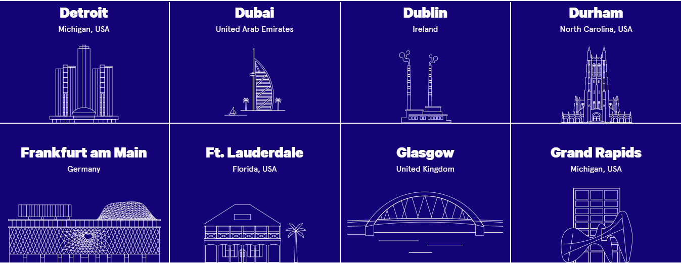
You must be thinking, should your travel website design be all about pictures and great visuals? Not at all, sometimes, you’ve got to keep things plain and simple. Use visuals and videos, but apply them sparingly and not for anything and everything. Remember, a lot of images and videos can increase loading time, which could make you lose out to the competition by a few microseconds. Here are a couple of interesting stats. Onthegrid is one great example, which showcases various cities with clever use of icons and vector graphics.
➢ Key takeaways
- Cut down the navigation time spent by a user
- Icons and vector graphics offer minimalism and quick loading times
Hit the play button
You’d say what’s the big deal about videos? Take a look at the prominently placed video of This is Egypt website and it will definitely blow your mind at the very outset. It’s eye-popping and jaw-dropping and hooks you from start to finish. We’d say, it’s storytelling at its very best. In fact, if your travel website design has a video at the very beginning, you have won probably half the battle. Remember our play and plug section that video is an absolute must for engaging your customers? And here’s news for you. Hate noisy autoplaying videos? Well, Google Chrome will finally block them in its latest version. What’s even more interesting is that the browser will also remember your preference in case you do decide to hit the volume button. What are the implications for you as a travel website? It means your stunning video can be missed by your potential customer or client all because you decided to keep the volume up. So, here’s an insight. Keep that video muted and let the users make all the noise about your travel website.
➢ If you still want more reasons, here’s the deal about videos on websites
- Videos are 45 times more likely to rank on the first page of Google than text results
- Social video generates 1200% more shares than text and images combined
- Users are over 27 times more likely to click on an online video ad than a standard banner ad
Now those figures are inspirational. Aren’t they? https://www.youtube.com/watch?v=mfxQy5A\_tHs
Wish you had a great storyteller?
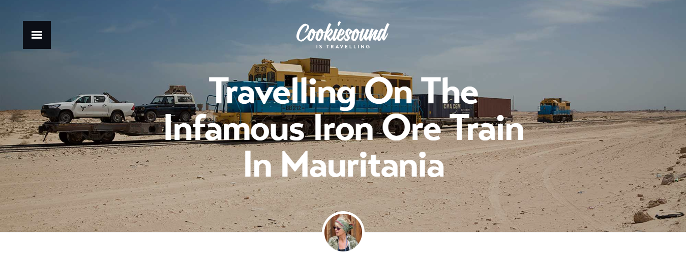
Storytelling is the greatest art, which has carried on over the ages, right from the caveman days to Instagram today. Creating travel experiences and sharing stories are one of the best ways to inspire people all over the world to travel. Take, for example, this mother-daughter travel photography duo that have tons of inspirational stories from around the world with breathtaking visuals.
➢ What we can learn from this site
- Integrate stories into your travel website design aesthetically.
- Stories make your content believable, relatable and shareable with the users.
Now isn’t that one great story to read and share?
Don’t be a multi-cuisine restaurant. Be exclusive.
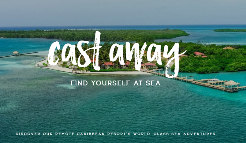
Would you like to cater to everybody or a select-few that can drive your business? If you cater to a specific travel business or audience, your design should reflect that. Find your niche and be extremely focused when it comes to your travel website. We’ve told you the importance of Marking your territory. The Turneffe Resort is inspirational and a great example of it.
➢ Here’s what you need to focus on:
- Right from the opening banner till you scroll down the page of every link, focus on your niche. Nothing more, nothing less. Period.
- Be it biking, kayaking, walking or historical tours, make sure the design is reflected on your tour operator website
Your website is like a big party. Give it a theme.
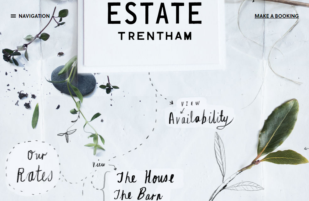
Remember those theme parties you had in school and college? Weren’t they memorable? The same goes for your website. Add a theme to stand out from the crowd. The Estate Trentham, does just that with its clever use of flora from the region and offers you a refreshing experience. Quite literally.
➢ Here are your key learnings
- Keep a theme related to your destination, travel business or your passion
What’s your proposition?
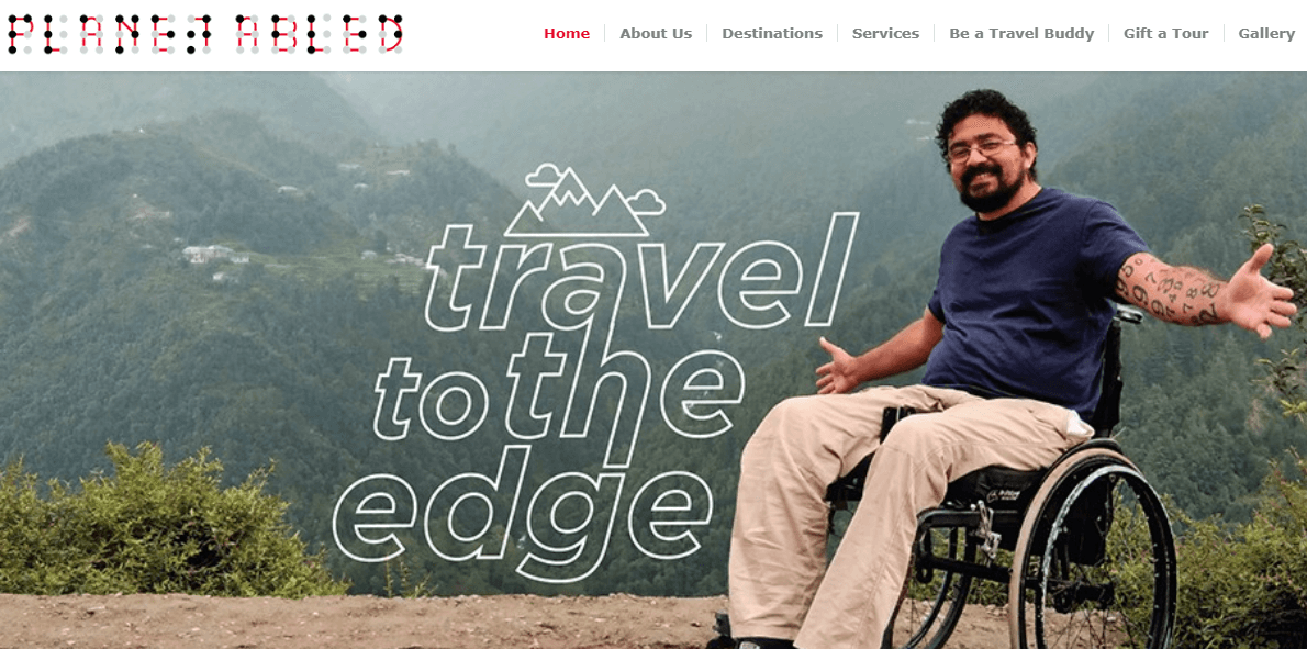
No two people are the same. That’s what makes us humans, so complex and yet amazing. This is why we have different travel needs. And there’s a huge untapped audience across the globe. Planet Abled is one of the most inspiring travel website designs out there. It caters to tourism for the physically challenged and specially-abled people who are willing to travel in India. Its aim is to make tourism more accessible for this audience. And this noble thought is well reflected on their website, right through.
➢ Here’s the bottom line?
- Define your exact proposition like we’d mentioned earlier
- Keep your communication consistent throughout your website
- Never digress from your core proposition and weave it across the website
Quality beats quantity. Any day.
Aren’t you lost in too much content sometimes? The last thing you want your user is to be surfing too many things on your website in too little time. This does not give them a feel or vibe of your travel website design. We’d like you to see Heritage Tours website for inspiration.
➢ Here’s what you need to learn from it
- Quality content beats quantitative content. We’d stressed previously on creating content that offers a delightful experience to the user
- Like this website, you need to build plenty of room on your travel website for your customers. This will help them breathe and explore the rich visuals and information that you’d like to share
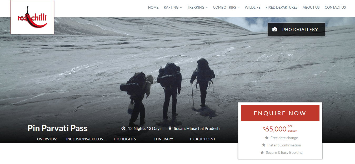
Keep the right things at the right place
If you have a variety of local tours and itineraries, make sure you design them fluidly and place them smartly on your travel website. Just like Red Chilli Adventure. Another handy tip, if you have an enquiry form, keep it visible at all times so that the user can fill it in quickly.
➢ Here’s what you need to do
- Let your offers stand out
- Keep a floating enquiry form for a landing page
- If there’s a button for booking tours, let it be there upfront
For starters, we can help. We’ve already mentioned the fundamentals in the beginning. Next up, you’ll need some great tools. You must be thinking why take our word? That’s because we’ve helped 200+ tour operators across the globe to build their websites. What about the marketing? Well, we have a solution for that too.
So, if you’d like to begin your journey of creating a stunning travel or tour operator website, take a look at some of our pre-designed themes.
Ready to travel with us to design your website? Get in touch with us today. We’re waiting.